

YES FW19/20 Snowboard Preview
Retail Buyers Guide: Snowboards FW19/20
Brand: YES. Snowboards
Interviewee: Alex Warburton / Global Brand Director / Designer
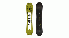
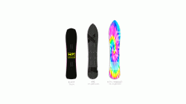
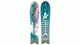
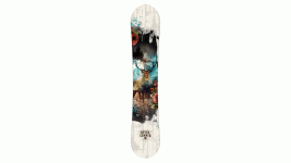
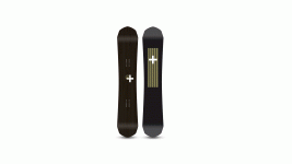
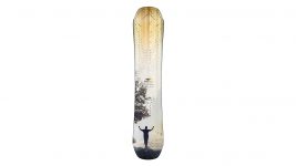
YES-JACKPOT
KEY PRODUCT FOCUS: Please pick the three most exciting boards from your new FW1920 line and tell us about them.
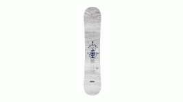
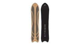
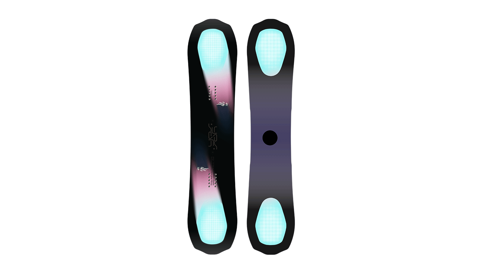
20/20:
For the past 2 years, we’ve been designing and prototyping new variations of the 20/20 in an effort to draw out more refined floatation through base contours while improving on-resort performance. The new 20/20 is a result of this exploration.
The most visual change is the Coreless tech that creates a translucent “hole” at each of the PowderHull areas. This allows for a lighter swing weight and the more refined bottom contours we had developed. The MidBite outline has found its most effective home on twins and applying an aggressive version of this outline to the new 20/20 has brought out the kind of park and resort performance we always knew it was capable of.
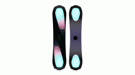
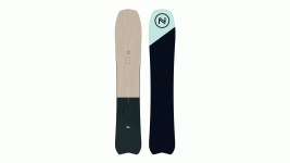
Hybrid:
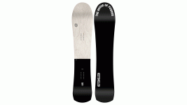
The Hybrid – aptly named – takes it’s cues from a combination of the 420 and the PYL design philosophies. It has the shorter/wider surface planning of the 420 then applies our exclusive Tapered UnderBite outline originally unveiled on the PYL. Floaty and manoeuvrable with confident edge hold and responsive snap out of turns, it really is the perfect hybrid of the two experiences.
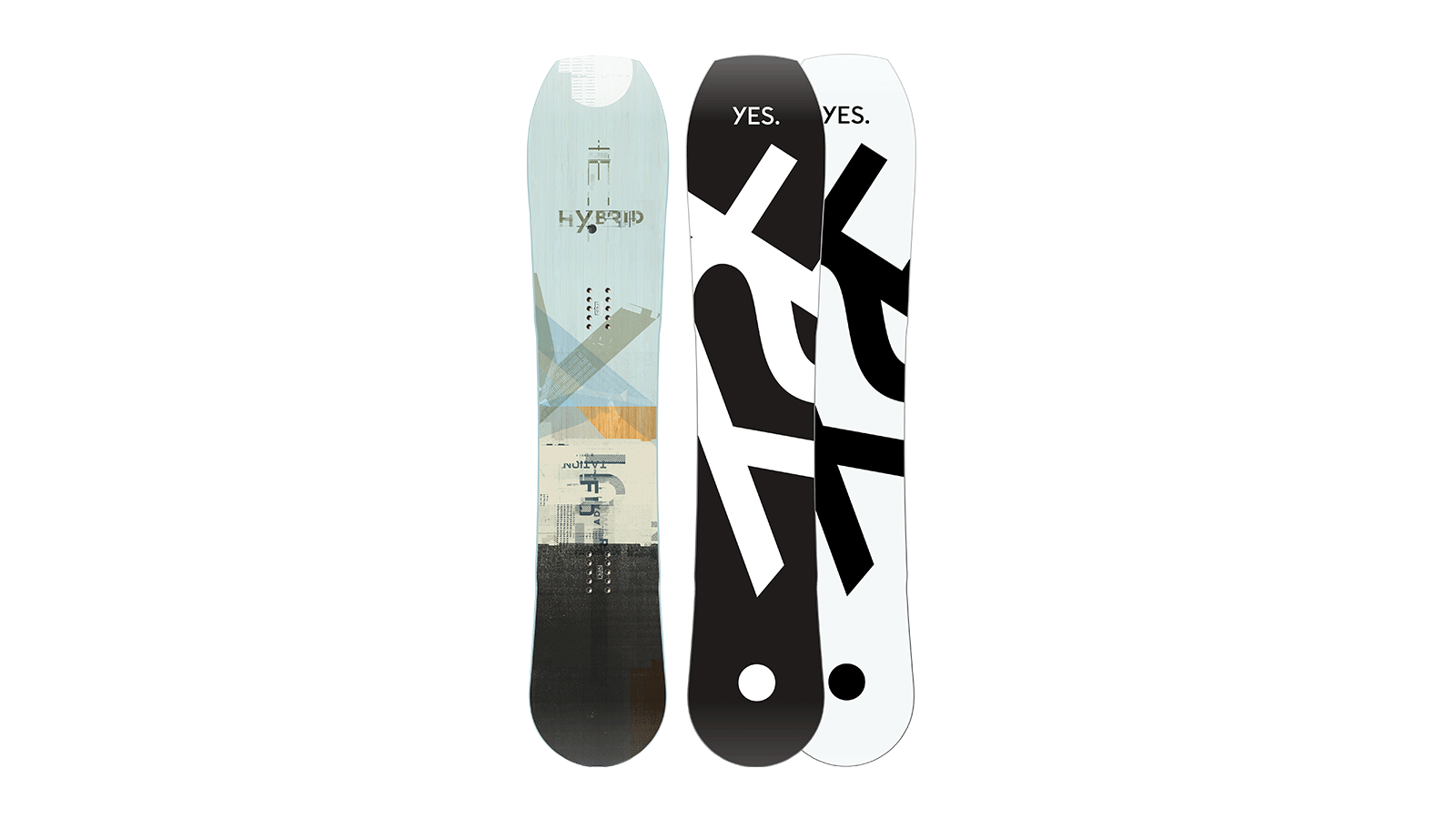
YES-HYBRID
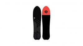
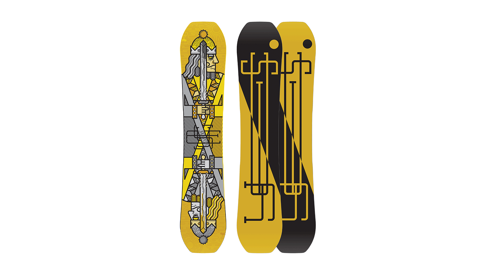
Jackpot:
The Jackpot introduced the original MidBite outline 3 years ago that has since trickled through the line whenever either a new or updated Twin is on the roster. This new Jackpot features a wider overall platform and new midebite/sidecut ratios to suit the ever-advancing park and pipe environment. As the Jackpot is designed primarily as a park/resort board is has a unique tip and tail profile not seen on any of our other models that employ a sharper transition off the contact points to a flatter, more drawn out kick.
Constructions. This is the place where you can talk to us about the new ingredients in your boards, and how you are building differently. We’re interested in anything new in inserts / edges / cores / sidewalls / glue / resin/ wood types / base material etc here.
Coreless tech – featured on the new 20/20.
The coreless technology was inspired by the creative genius of George Greenough and his seminal experiments in kneeboard designs during the ’70s. By removing wood in the tip and tail we naturally removed critical swing-weight, but it also allowed for more refined bottom contours, unconstrained by the limits core materials.
Which price point is seeing the most action at retail? Premium, bottom or in the middle? What do the people want?
YES. has always held the belief that value in our designs and quality manufacturing will win out over the race-to-the-bottom game that the industry giants played for the past few decades. And our sell-through numbers are proving us right. Dumping shitty product for 100$ less was never getting any new people off the couch and into the sport -if anything it turned people off and is partially responsible for the decline we’ve seen the past decade. Boards like the Greats UnInc and the Standard are actually selling the same numbers as the Basic. And when we introduce boards like the 20/20 or the Globe NSB, no one ever baulks at the pricing because the value is immediately appreciated.
Consumers are more open than ever to unusual shapes. Got any super mad shapes next year? How long will this new shape direction last… is it a good thing for snowboarding?
I don’t think you’ll be able to fool a consumer by simply chopping a fucked-up looking nose and tail shape on a board in the near future. But in terms of real design, snowboarding is in a true renaissance that I think is the new norm. There are so many good designers out there now – both established and the growing garage brands – and the customer is winning. Having different shapes creates different experiences riding down the hill and that really keeps it fun and interesting.
YES-2020
We’re really interested in graphic themes running through your line. What is your art department feeding you for next year?
Every year about half our line is done by outside designers. Half of those are people like Dustin Ortiz, Bryan Ray and Tyler Quarles who are all fantastic to work with and have been a big part of the brand’s visual development. And the other half is new creatives like Catkin Pritchard and Anja Bruan that have brought new energy and ideas to the line.
This year, in particular, I was excited and honoured to work with legendary designer Scott Clum on the Hybrid graphics. Scott was a Sims team rider in the early eighties and became the brands graphic designer by the end of that decade. In the early nineties, he art-directed the explosive Morrow brand during its most creative and groundbreaking years, which is where our friendship began. He has been on the cutting edge of creative exploration through a variety of mixed media ever since and was pumped to get back to doing a board graphic again.
Brand Previews